| Graphed Measurements |
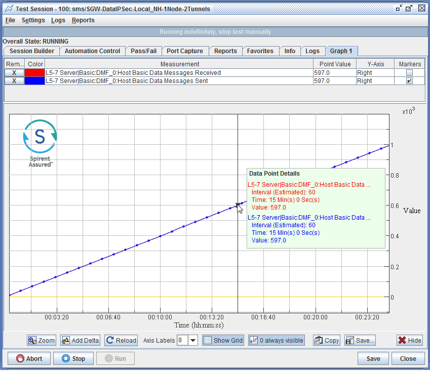
Table of the graphed measurements is laid out with 6 columns:
| Remove |
The Remove button allows you to remove the measurement from the graph. |
| Color |
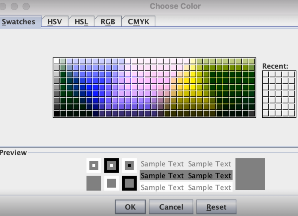
The colored cell indicates the color of the plotted line for the measurement. To change the color of the plotted line for the measurement, double click on the Color box for the selected row. A pop-up with a selection of colors will be displayed :

Select a color and click OK. The new selected color will be displayed in the plotted line for that measurement.
|
| Test Case |
As of release 17.4, the Session Builder full name for a test case including instance name, Test Case type and Test Server / TC Indexes for a specific measurement is now shown. |
| Point Value |
Indicates the value of the interval points. |
| Y-Axis |
The toggle option allows you to pick the Y-axis to be displayed on the right or left of the graph. |
| Markers |
The Marker checkbox allows you to enable/disable data pointers for the measurement. Markers are off by default. Each marker represents a reported measurement data point, which helps identify measurement lines and assist with understanding the rate at which data is being collected.
|
NOTE: You can right-click or left-click on certain column headers to change all measurements, e.g., Remove All, Set Y-Axis for all, select/clear Markers for all.
|
|
|
| Zoom |
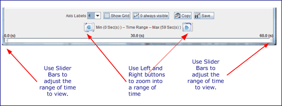
Click Zoom to launch a separate application window (not a dialog and not an internal Client window). The Chart Snapshot Zoom Utility window is a snapshot of the current chart/graph from your test session and does not support live update of data.

-
You may zoom into a range of time, use the Left and Right buttons.
-
The slider bars at the very bottom let you adjust precisely what range of time you wish to view.
|
NOTE: When 0 always visible is not enabled, the Y-axis also zooms.
|
|
|
Delta
|
Select the Add Delta button (or Right-Click your mouse) to show the Delta of 2 data points, lines, or sets. Only one delta line displays on either of the Graph tab.
Selecting the Add Delta button or Right-Clicking your mouse displays a dialog box to pick two measurements (lines/sets) between which to draw the delta. The Delta Line is light gray with Greek Delta shaped symbols for markers.
|
NOTES:
- Delta = First selected measurement — Second selected measurement
- The historical data points are drawn based only on the time-matching data points of the two source measurement sets. That is, if one measurement is reported once a second and the other is reported once an interval, the delta line will only show points on the interval. However, if both the source measurements have been reporting and graphing points each second, then the delta's historical portion will include data points for each second.
- If either of the measurement sets used to calculate the delta are removed from the graph, the delta will also be removed.
- The delta line is only updated (i.e. more points added) after each interval.
- If a delta line exists, a right-click displays a dialog box asking whether to remove the delta.
|
|
|
Data Point Details: Click on any spot in the graph area and a Popup window displays the measurement values for the closest data point highlighted with an "X" for each plotted line. In addition to displaying the measurement interval, time and value of each plotted line, the Popup panel also includes information about the closest delta data point (e.g., Delta: Set 1 — Set 2).
|
NOTES:
-
To de-select a point on the graph, either click the middle-mouse button or press control + left mouse button.
-
Select a point on the graph to include a value in the Point Value column of the graph table. The selected points will be cleared when you select the next point on the graph.
|
|
| Reload |
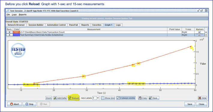
The purpose of reload graph is to monitor rates, or P-I values from the start of a test, until the interval period is doubled, watch the graph (display not as desired) and then reload.
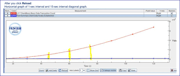
When viewing a graph, you can force a reload of the measurements with the reload button. This is helpful when your interval period changes and your P-I values will be off-line, or if you wanted to normalize a graph with 1-second measurements and 15-second measurements.
The example shownexample shown is for illustration purposes only.
Graph with 1-sec measurement and 15-sec measurement:

You notice that the historical data is now interval based,
and the 1-second values, the blue line goes to left-to-right
vs red line is diagonal at 15-sec interval.

|
- Axis Labels
- Show Grid
- 0 always Visible
- Show Bar
- Copy/Save
- Hide
|
-
Select the number of Axis Labels to show from the list.
-
Select the Show Grid to show a grid on the graph. The Show Grid is off by default.
-
Select 0 always visible to show 0 measurement on Y-Axis (Force 0 on Y-Axis). When you graph two or more measurements, you can plot them against the same scale or plot each against a separate scale. Set the default selections for both options in your Client Settings.
-
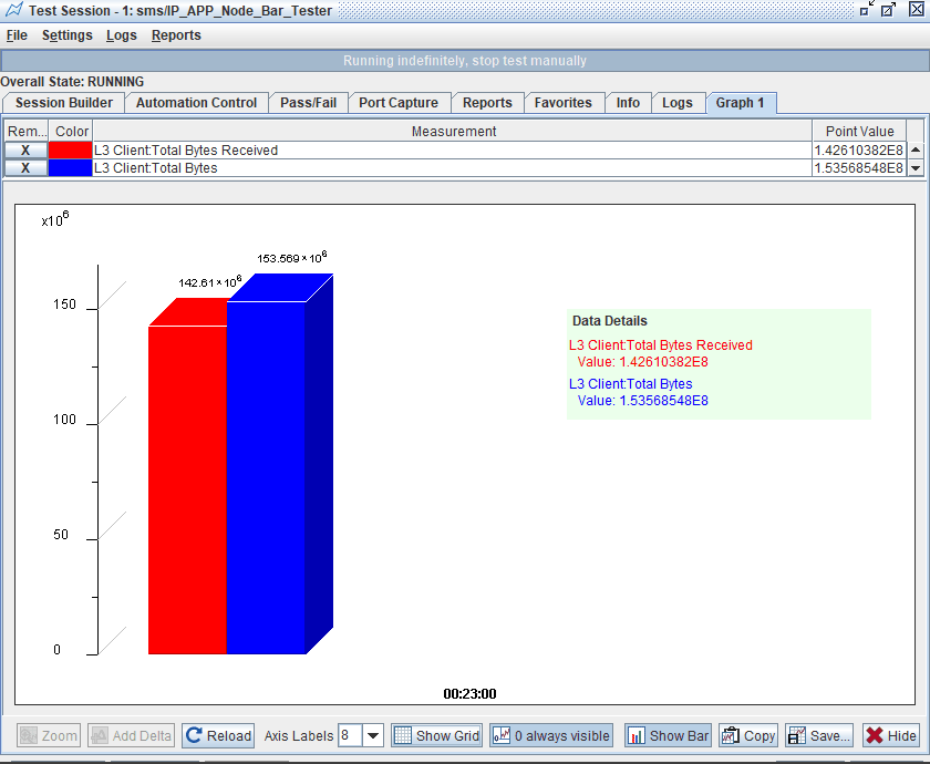
Select the Show Bar to display the most recent completed interval of values for the added measurements in a bar graph using the same colors as the line graph. The individual interval value will be displayed at the top of each bar. For selected measurements in the associated table, the bar will highlight the top & right edges of the associated bar (s) and display the measurement name at the bottom of each highlighted bar. Left clicking anywhere on the graph will display a popup containing every measurement name & value. The bar chart shows the most recently created interval, redrawing each time a new interval occurs. And it only supports one Y-Axis. Negative values will be represented in bar in absolute value terms, but the value label above the bar will still reflect the actual value. Toggling the Show Grid button option will hide/show the Y-axis grid 3D lines. Other options such as 0 zero always Visible and Add Delta are disabled in bar graph view mode. The Show Bar is off by default.
-
Capture a snapshot of the graph with the Copy and Save buttons. You can also copy by pressing F9 and save with the Shift-F9 key combination.
-
Click Hide/Control-Right-Click to hide/show the tool bar.
|
NOTES:
-
When starting test session, the bar graph will display all measurements as 0 until first 15 second interval has completed
-
The bar chart setting is not a property of the saved test, it’s just a toggled temporary view. If you save your test while viewing the bar chart and reopen and run it later, it will initially display as line chart, just click the button to see the bar chart
-
If you make your chart window too small, the bar chart will not display, you will get a warning text “Screen too small” in place of the chart
|
|
